


This project was created as part of a design competition. Among many participants, respondents highlighted two designs, including mine (about 75 votes).
I really like this concept myself and I want to tell you more about it.
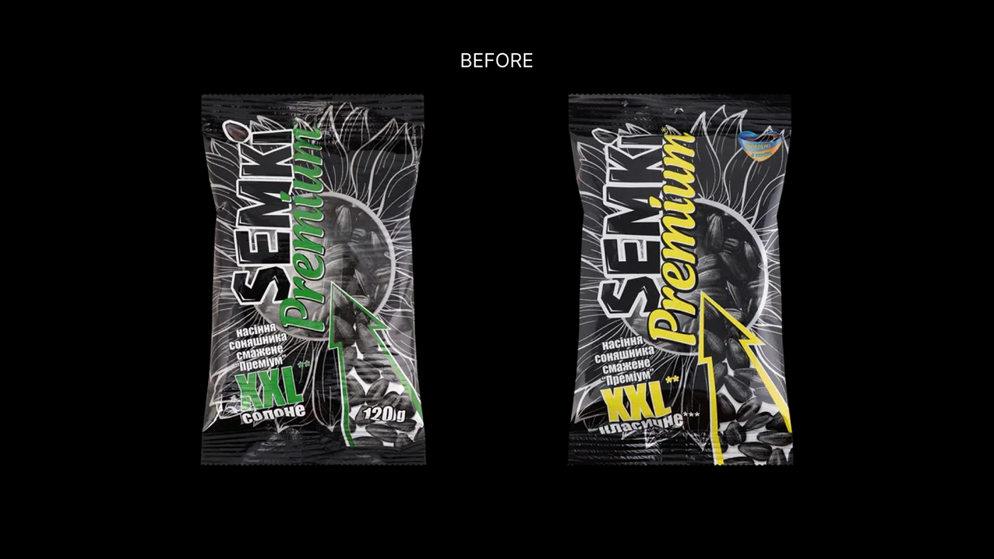
Task:
-Redesign outdated packaging
-Develop a bright and modern packaging that stands out among competitors and attracts attention
-Create a vibrant and friendly atmosphere on the packaging (this is determined by the conditions
of seed consumption - seeds are often eaten during friendly gatherings or at home in front of the TV)
-Maintain Ukrainian production identity, but not overly emphasized
-Maintain Ukrainian production identity, but not overly emphasized


Currently, there are certain trends in packaging, and more and more manufacturers are transitioning to something new and illustrated. Illustrations help to create a friendly, fun, and light atmosphere that is present at home parties, outings, or movie nights; they help
to make the packaging brighter and more memorable, as currently, among competitors,
a pack stands out only with a recognizable logo.
The main advantage of the brand "Semki" is that their seeds are of the highest caliber, so the packaging focuses on a hand holding a large seed in front of rays of light (as a farmer evaluates his crop, carefully examining each seed). The colors I chose are a nod to the Ukrainian flag to emphasize Ukrainian production.


That's all, thank you for your attention.
Please evaluate the concept with a like
and a comment.
For orders, please message:
gmail: lizstarova@gmail.com
telegram: @starova_ua


